Contentsquare Blog Post – How to Improve Customer Experience: Three CX Cards you Need to Play
James Fearne is Contentsquare’s Lead Customer Success Manager, working with clients such as Pandora, Disney, Toyota, and Virgin Media. In his session at CX Circle, he talked us through three of his hottest tips on how to improve customer experience and build a website that converts. So grab yourself a cuppa and let’s take a look…
The state of digital in 2021
James is constantly speaking with and learning from our Contentsquare clients. Over the last few months, the feedback he’s been getting about digital marketing feels pretty similar across the board:
- “Even though stores are reopening, digital is still our biggest focus this year.”
- “We’ve been given stretch targets to make up for last year, but our resources are being cut.”
- We’re trying to squeeze every penny out of our website with the resources we have.”
Sound familiar? You’re not alone. It looks like many big brands are wondering how to improve customer experience in a way that won’t break the bank.
So here are three things you can do to make your website work harder for you without spending a ton of money, according to James.
How to improve your customer experience
Customer experience card 1: Prioritize Google Core Web Vitals
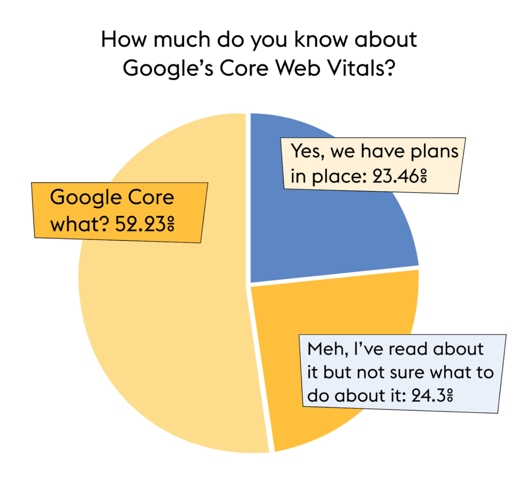
James’ first tip on how to improve customer experience is to get your site ready for Google Core Web Vitals. But interestingly, out of all those polled at our CX Circle event, only 23.46% had plans in place. So it seems some more education around this topic is in order.

We wrote an in-depth piece on how to optimize your site’s Core Web Vitals, but here’s James’ shortened explanation of what it means: “Previously, Google used on-site content to rank websites from an SEO perspective, but they’re now moving towards much more technical page-performance metrics.”
And these are the three key metrics you need to be aware of:
- Largest Contentful Paint (LCP): How long it takes for your page to load in the eyes of the user.
- First Input Delay (FID): The time it takes for your page to respond when a user interacts with it.
- Cumulative Layout Shift (CLS): How much your site moves around as the page loads.
If you want to make your website work harder for you in 2021, you need to analyze your website in light of these core metrics. Because Google ain’t budging on them (not in the near future, anyway).
And in terms of improving your customer experience, nailing your Core Web Vitals will help create a frictionless experience for your customer, one that doesn’t see them bounce because of slow load times or dodgy loading pages.
So if you’re wondering how to improve your customer experience immediately, make sure Core Web Vitals is on your list of priorities.
Luckily, at Contentsquare we’re all about making digital optimization easier for you. And our brand new page performance monitoring tool is centered around helping brands nail their Core Web Vitals.
“Our clients can now see how each of their pages performs against these metrics,” explains James.
“It’s going to be invaluable to use this data to actively improve how a site is built and how it works. There’ll be instant results in your page performance score, but also in your SEO score moving forward.”
And some quick win advice from James:
- Analyze what content your users are actually consuming and engaging with, then start removing any redundant content to decrease your load times.
- Use a browser cache that helps load content faster, which helps your users’ browser blast through JavaScript loading tasks faster.
- Add new UI elements below the fold so they don’t push down the content the user expects to stay where it is.
Customer experience card 2: Voice of Customer
“Voice of the customer means qualitative feedback from your customers, such as feedback buttons, surveys or questionnaires”, explains James. “Qualitative data is brilliant because it provides real, emotive feedback directly from your customers. They’re telling you word-for-word what they’re thinking which is invaluable.”
But it isn’t always the best way to surface and sort potential issues – to create the best possible customer experience, you need quantitative data to ensure you’re using your time efficiently.
“Quantitative data helps back up the why with the what. It makes sure you’re fixing what most of your customers are struggling with first, before branching out to smaller issues that affect a minority,” says James.
Luckily, of those polled 74.52% are already combining quantitative and qualitative data.
Case in point: Sky
The situation
- Sky has around 4.5 million customers per week who try to sign in to Sky.com
- Over 6% of these customers have trouble remembering their username and password
Using qualitative and quantitative data
Sky uses a voice of the customer tool called Qualtrics (also a Contentsquare integration). They interrogated their data to find out that 95% of customers who quote ‘log in’ in their feedback rated the experience as ‘difficult’ or ‘very difficult’. But why?
Through Contentsquare’s platform, they were able to find out:
- 5.6% of people click on the ‘Forgotten username or password’ link.
- A further 21,000 visitors get a ‘Wrong username or password’ error message.
- Our customer journey analysis tool showed them 17.6% of visitors left the site directly after viewing the sign-in page.
- Our zoning analysis tool showed that 70% of people were clicking on the ‘Forgotten password’ field more than once and 50% were clicking the ‘Sign in’ button more than once.
Through quantitative and qualitative feedback, Sky gained a better understanding of why their customers were leaving negative feedback on these pages – and can now build data-driven hypotheses to tackle the problem and reduce call center costs.
Quick win advice:
- Use your full tech stack to get a well-rounded view of what your customers are thinking.
- Don’t look for individual problems, quantify what most of your customers are struggling with, and optimize that first.
- Don’t forget positive feedback, too! It’s important to understand when your customers are happy and tap into those experiences in the future.
Customer experience card 3: Optimize experiences by channel
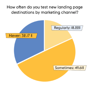
How often do you test new landing page destinations for your marketing channels? According to our poll, for the majority of you, the answer is: not often enough!

According to Iterable’s 2021 Marketing Trends report, we know that almost two-thirds of marketers view increasing customer acquisition as their top priority.
“But I think it’s fair to say that shoppers, in general, are becoming less loyal to brands and savvier than ever before,” says James. “So it’s a real battleground to acquire that new traffic. Therefore, it’s really important to optimize experiences for each channel.”
James’ final tip on how to improve customer experience? Test your marketing channels and landing pages. And do this consistently. It’s free and easy to do, but the outcomes could be huge.
Paid search, social, email campaigns, display; customers that come from these channels are different types of customers – and at different points of their journey – so you need to be careful where you’re sending them.
“Testing landing pages is a really cost-effective way of generating more revenue and learning more about your customers and learning how to improve your site,” explains James.
Case in point: Pepe Jeans x Dua Lipa

The situation
Pepe Jeans ran an advertising campaign in Vogue to promote their clothing collaboration with Dua Lipa.
Optimizing towards user intent
Using Contentsquare’s AI insights shortly after launch, they found bounce rates on the homepage were unusually high. Diving further, they could see the majority of the 250% increase in traffic on the homepage had come through the Dua Lipa campaign.
The problem? Users clicking on the Dua Lipa ad were being sent to the homepage which had no correlation to Dua Lipa. There was a huge disconnect in their user journey, so customers left immediately.
Less than three hours after uncovering the issue, Pepe Jeans redirected users to the correct Dua Lipa landing page and saw an almost immediate 75% decrease in bounce rate.
The takeaway
Your landing page matters. In fact, it can make or break your campaign. So test, test, test.
Landing page tests to try:
- Abandoned basket campaigns: Test sending your abandoned basket campaigns to your Product Description Page and your Basket to find out what works best for your customers.
- Paid search traffic: Test sending your paid search traffic to a homepage rather than a PDP. This lets your customer explore your site themselves, before narrowing down what they need.
- Product description page vs hybrid landing pages: For more generic browsers who don’t know what they want yet, show them a hybrid page with more content to browse, rather than just a product description page.


